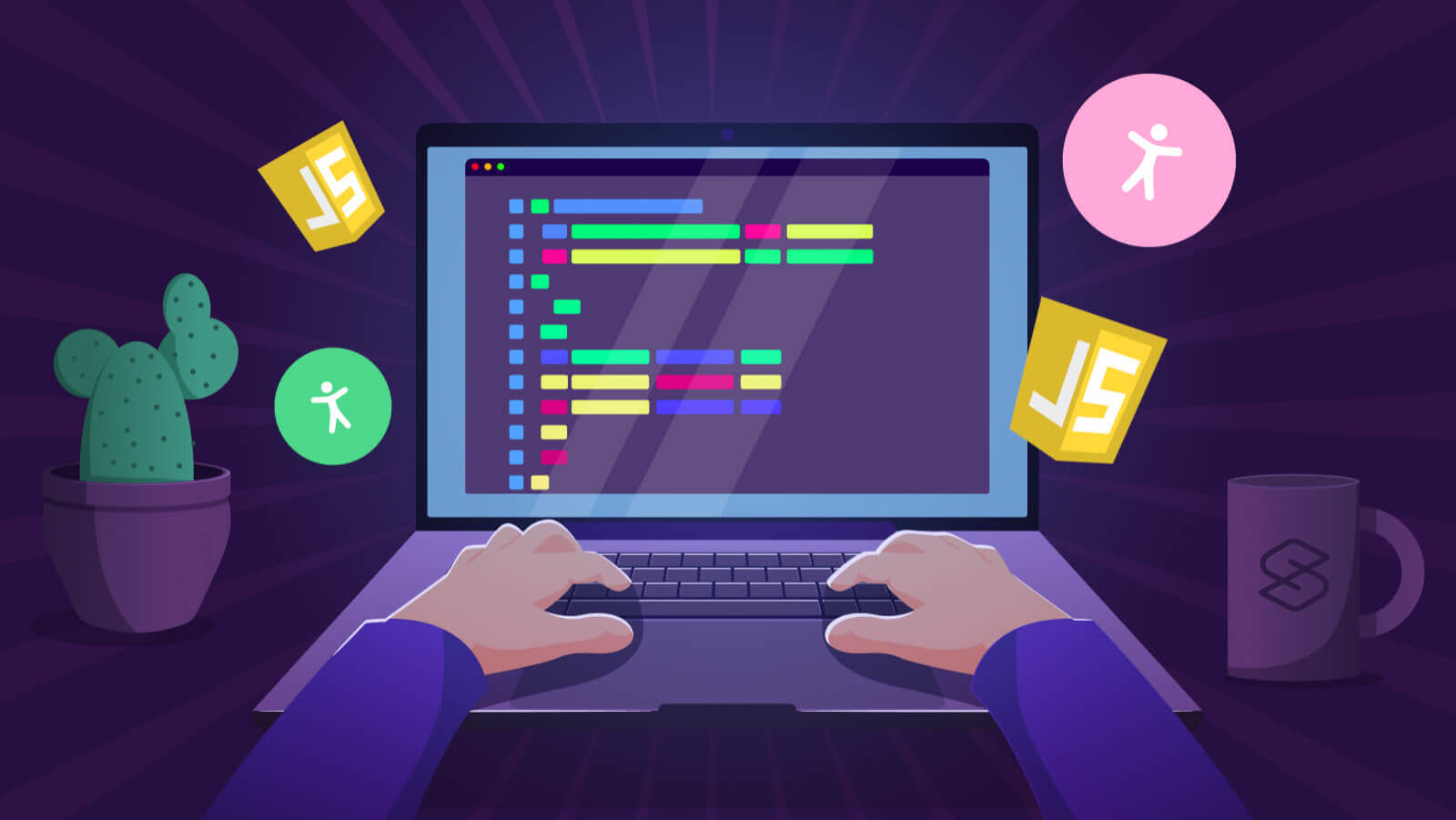
Over Time | Visualizing Architecture https://visualizingarchitecture.com by Alex Hogrefe Thu, 07 May 2020 23:38:24 +0000 en-US hourly 1 https://wordpress.org/?v=6.3 Desert Night Tutorial: Part 2 https://visualizingarchitecture.com/desert-night-tutorial-part-2/ https://visualizingarchitecture.com/desert-night-tutorial-part-2/#comments Sun, 25 Mar 2018 18:24:12 +0000 https://visualizingarchitecture.com/?p=5798 Part 2 of this tutorial will break down the Photoshop side of this illustration.  In terms of Photoshop complexity, this image is relatively simple and minimal in layers. However, I think it is a good example of how a compelling image can be generated with just a few basic moves. This part of the tutorial is quite long and fully breaks down every aspect of the Photoshop file. It is probably one of the most detailed tutorials that I have ever written in terms of covering the entire process. My hope is that it will give a more complete picture of my entire workflow from start to finish and better show where I choose to emphasize color and texture compared to where I try to tone things down. In case you missed it, Part 1, which discusses modeling and V-Ray settings can be found here.


1. Setting Up Base Files


1A. The first thing I want to do is setup the base rendering. When I open the V-Ray RGB rendering, I convert it to a smart object. I do this by right-clicking on the layer and choosing “Convert to Smart Object”. This ensures that I will not cause destruction to the layer if I adjust the tone or levels. It also will allows me to replace the rendering with an updated rendering later if I need to. I also wrote a post a while ago about the advantages of smart objects HERE.


1B. Next, I want to remove the background. To do this, I choose “Select>Load Selection” which will bring up a “Load Selection” dialogue box.


1C. Choose the “Alpha 1” in the Channel drop down menu and then choose “OK”.


1D. When the Alpha is loaded, it will give a selection of the background. Once this selection is active, create a new group in the Layers Palette and then choose “Add Layer Mask”. When I drag my V-Ray RGB rendering layer inside of the group, the sky will be removed. Any other render elements that I drag into this group will also have the sky removed such as the Reflection, Refraction, and Raw Light elements. This avoids the need to create new masks for each element.


2. Adding the Sky


2A. I start the sky by first creating a new group under the “Base Files” group called “SKY”. Within this group, I create a new layer called “Sky Soften”. Using the “Brush Tool” with a soft tip and medium opacity, I slowly paint in a gradient from light to dark blue. The goal of this is to set the main color tones of the sky.


2B. Next I drag in my sky texture and place it above the “Sky Soften” layer.


2C. The sky texture is too strong so I lower the opacity of the layer to 34% so that the detail is subtle and not grabbing too much attention.


3. Background Mountains


3A. Using Google Earth, I was able to go to “Street View” at the location of the Desert House and save out a few screenshots. I then cut out the mountains to place into the illustration.


3B. Once the mountains are cutout, I can drag them into the illustration. I darkened and colorized them to give them a slight blue tone. I also made sure the “Mountain” group was below my “Base Files” group to take advantage of the alpha mask.


4. Ground


4A. To start editing the ground, I first need to create a selection of the ground. I did this by dragging in the “Material ID” V-Ray element (discussed in part 1) and placing it at the top of the Layers Palette. Next, choose “Select>Color Range” to bring up the “Color Range” dialogue box. Pick the color of the ground, in this case, the brown color. This will highlight the ground in the “Color Range” dialogue box. Adjust the “Fuzziness” slider to refine the selection as needed. Then click “OK” to load the selection. With the ground selection active, create a new group called “GROUND” and choose “Add Layer Mask” at the bottom of the Layers Palette. I now have a container to add in many textures without needing to create new masks for each texture.


4B. In the “GROUND” group, create a new layer called “Shadow”. In this layer, I use the “Brush Tool” with black paint, a soft tip, and medium opacity to darken the ground which better matches the lighting of the scene.


4C. Next, drag in some ground textures. I am using about five different images to make up the foreground, mid-ground, and background textures.


4D. Once all of the textures are in place, I set the “Blend Mode” of the entire “GROUND” group to “Overlay”. This sets the textures into the image and picks up the shadows and colors of the ground.


4E. Finally, I want some of the glow of the interior to wash across the ground. To do this, create a new group called “LIGHT” inside of the “GROUND” group. Inside the “LIGHT” group, create a new layer. Then select the “Brush Tool” with a light orange paint, a soft brush tip, and low opacity and start painting in the warm colors. Finally, set the “Blend Mode” to “Overlay” to blend the warmth into the ground.


5. Roof Textures


5A. For the roof textures, the process is the same as the ground textures. I create a group called “ROOF” with a mask applied. In it, I add textures and set the “Blend Mode” of the group to “Overlay”.


6. Interior Light


6A. For the interior lights, I again create a new group and call it “INTERIOR LIGHTS”.  I place this group into my “Base Files” group so that I can take advantage of the Alpha selection. Inside the “INTERIOR LIGHT” group, create another group called “CANOPY GLOW” with a mask of the area highlighted in green.


6B. Within the “CANOPY GLOW” group, create another new layer called “Warm Glow”. Then select the “Brush Tool” with a light orange paint, a soft tip, and low opacity. From there, slowly add in the light orange paint. Finally, set the “Blend Mode” to “Overlay” to blend the warmth into the image.


6C. There is also glass on the back side that will be adding warmth to some of the roof. Create a new group with a mask revealing just this section.


6D. Again, use a soft brush with a light orange paint, soft tip, and low opacity to paint in warmth in this area. Finally, set the “Blend Mode” to “Overlay”.


7. Fog


7A. Some fog is added to give just a hint of depth to the image. I usually do this in a group called “EFFECTS”. To add in fog, create a new layer, select the “Brush Tool” with a light blue paint, a soft tip, and very low opacity. Slowly paint in the haze focusing most of it near the horizon. I have several fog layers to better manage the density of the fog and to better control opacity in different areas.


7B. This image shows just the fog layer on a black background. You can see it is very subtle and focuses mainly near the horizon.


8. People


8A. Normally I like to place people behind the fog layers. However, in this case the “PEOPLE” group is placed on top of the “EFFECTS” group for more control with their toning. To get started, I first drag in one of the cutout people and convert the layer to a “Smart Object”.


8B. Next, the person needs to be darkened to match the scene. Choose “Image>Adjustments>Hue/Saturation”. In the “Hue/Saturation” dialogue box, move the “Lightness” slider left to darken the person. Then choose “OK” to close out of the box.


8C. Next, again choose “Image>Adjustments>Hue/Saturation”. This time, check the “Colorize” box in the lower right, then slide the “Hue” slider to a blue tone that matches the sky and atmosphere.  Finally, slide the “Lightness” slider to the right to lighten the cutout and account for some of the haze in the image.


8D. To help ground the person, a shadow can be added. Create a new layer, then choose the “Brush Tool” with black paint, a soft tip, and medium opacity. Then paint a spot in the middle of the canvas.


8E. Choose “Edit>Transform>Scale” to thin the shadow and scale to match the person. The opacity may need to be lowered as well.


8F. Finally, repeat these steps for the rest of the entourage.


9. That “Instagram” Look


9A. I ended up posting this image on my Instagram page with a little extra color tweak. To create this extra bit of color, first create a copy-merge of all of the layers. This is done by creating a new layer, then typing “ctrl+alt+shift+E”. Then convert it to a smart object by right-clicking on the layer and choosing “Convert to Smart Object”.


9B. Next, choose “Image>Adjustments>Hue/Saturation” to bring up the dialogue box. Then increase both the Saturation and Lightness.


9C. Now, set the “Blend Mode” to “Overlay” . This should significantly enhance the colors of the image. I lowered the opacity to tone down the strength just a little bit.


9D. Next, create a new layer and fill the new layer with a blue paint using the “Paint Bucket Tool”.


9E. Set the “Blend Mode” of the blue color layer to “Color Dodge” and then lower the opacity to about 20%.


9F. Finally, with the “Brush Tool” set at a low opacity, create a new layer, select a black paint, and darken both the bottom and top to create a vignette effect.


Final Image


I have never done such a comprehensive tutorial on my site like this before. I tried to cover every aspect of the making of this image. However, if I forgot something or didn’t explain it well, leave a comment or send me a message and I will do my best to correct/add to this post as needed.


]]>
https://visualizingarchitecture.com/desert-night-tutorial-part-2/feed/ 18
Architectural GIFs https://visualizingarchitecture.com/illustrations-as-gifs/ https://visualizingarchitecture.com/illustrations-as-gifs/#comments Mon, 06 Mar 2017 00:20:03 +0000 https://visualizingarchitecture.com/?p=5225 As old school as they are, GIFs can still be a low tech, highly shareable solution to communicate an architectural idea. In this case, I was having trouble deciding how to illustrate the operable shade system of my research lab design. Enter the GIF. The obvious downside is that this solution only works for digital presentations (website, social media, email, etc). Therefore, I still rendered and Photoshopped each frame at a high resolution (5,500 pixels wide) to give me the option of using them in my portfolio later. If you don’t need high res images, GIFs are compressed so much at the end that it would save a lot of time to just render at the lower resolutions right at the start. Below is a quick breakdown of how I created the GIF.


1. Create Base Renderings of All Frames


I setup my 3D Sketchup model to show the shade structure at different positions of operation. I then placed each shade position on a different layer, and rendered each option out using V-Ray.


2. Photoshop Each Position


The image above shows some of the main moves that I made in Photoshop to get the final look. Each one of these moves had to be setup in a way so that I could easily carry them over from one shade position rendering to the other.


This meant organizing the layers as carefully and cleanly as possible. The background trees remained the same for all frames, so I placed that at the bottom of the layer stack. Above the background group, I setup groups 1 through 5 representing each shade structure position. In each one of the numbered folders, I placed the base renderings of the corresponding position and other elements that changed with the shade positions such as tree shadows, reflections, etc. I then placed final effects like haze and sun glare into the “Effects” group at the top since these remain unchanged no matter what shade position group was turned on.


3. Turn on the Timeline


Once the layers are setup, it’s time to create the GIF. First, turn on the Timeline by going to “Window>Timeline”. This should bring up the Timeline interface at the bottom of the program window. Also in the Timeline interface, choose “Create Frame Animation” in the drop down menu.


4. Create the Timeline Frames


Assuming the layers were setup properly, this part goes pretty fast. To add new frames, simply turn off and on the layers you want, then choose “Duplicate Selected Frames” in the Timeline palette. Under each frame, you can also set a length of time by selecting it in the drop down menu.


5. Export the GIF


Once the frames are setup, its time to export. Go to “File>Export>Save for Web”. In the “Save for Web” dialogue box, there are quite a few options that influence the balance between quality and file size. Because my image has a lot of detail and gradients, I wanted to maintain better image quality which meant a larger and thus slower file to open and run . A) For the preset drop down, I chose “GIF 128 Dithered” which gives me the best color reproduction and smoothest gradients. B) To get the file size down, I changed the resolution from 5500px wide to 1200px which reduced my file size down to 2.5 MB. I should also note that I wanted my GIF to loop, so I chose “Forever” in the “Looping Options” dialogue box. Finally, I clicked “Save” to export the GIF.


The Final GIF


]]>
https://visualizingarchitecture.com/illustrations-as-gifs/feed/ 15
Train Pavilion Diagrams https://visualizingarchitecture.com/train-pavilion-diagrams/ https://visualizingarchitecture.com/train-pavilion-diagrams/#comments Mon, 29 Jun 2015 01:52:12 +0000 https://visualizingarchitecture.com/?p=4216 I have been playing around with some diagrams for the recent train pavilion design. The architecture diagrams that I create on this site have ranged quite a bit over the years. Lately, I have been gravitating towards a minimal approach for these types of illustrations. For this series, I experimented with creating a dialect between plan views and corresponding perspectives.  I used a simple color palette to help relate and orient the viewer within the diagrams.


Train_Diagrams_1_Spread_one

Train_Diagrams_2_Spread_two

Train_Diagrams_3_Closeup

Train_Diagrams_4_Closeup


All these diagrams were created using a Sketchup model rendered as a clay model in V-Ray. I then used that clay model as a base in Photoshop to apply color. To see some more diagrams that I have done in the past, I have added some links below which go into more depth on the workflow that I use:


1. Boston Greenway Diagrams

2. Boston Wharf Diagrams

3. Cranbrook Site Analysis Diagrams

4. Thesis Diagrams


]]>
https://visualizingarchitecture.com/train-pavilion-diagrams/feed/ 15
Boston Greenway Museum: Building Diagrams https://visualizingarchitecture.com/boston-greenway-museum-building-diagrams/ https://visualizingarchitecture.com/boston-greenway-museum-building-diagrams/#comments Sun, 12 Oct 2014 22:12:24 +0000 https://visualizingarchitecture.com/?p=3471 As the 3d model progresses, I find myself spending a lot of time defining and organizing the way different elements are grouped in the model. I posted a video a while back showing a time lapse of the construction of one of my models. I rarely use layers but instead rely on grouping to organize my models. This allows me to quickly move large sections out of the way to get to tight areas or focus on specific elements. Organizing the model into groups also saves a lot of time when it comes to illustrations. For example, exploded axons and x-ray illustrations are pretty easy images to create when the model is set up properly.

In the case of this model, as I was organizing the elements to help me gain control of all of the geometry, I realized that there was a diagram here. The way the model was grouped was also a way of explaining the project design. Each model I build is organized in different ways depending on the use, material, complexity, etc. In this case, the use is a museum/educational space. I therefore separated the model into the plinth, vertical circulation, public space and circulation, program, curtain wall/glass, and structure which wasn’t used in the diagram.


va_Boston_culture_diagram_final


va_Boston_culture_elevation_1_final


va_Boston_culture_elevation_2_final


For diagrams like these, I rarely use textures in the model. I am trying to convey a specific set of ideas which materials can sometime confuse or dilute. In the illustrations above, I rendered everything as a clay model, which can easily be done with material overrides. For V-ray, this option is found in the “Global switches” tab and then checking the “Override Materials” box. As different as the above illustrations look, the workflows are nearly identical. I’ll give a quick break down below.


1. Background

The tone of these diagrams is set by the background color. I often start with a color scheme that will inform how I will make decisions as the illustration progresses. I probably tweaked these colors 20 times before I settled on the green and blue tones. Even though I knew the initial colors would change, I still wanted to start with a darkened background because that gives me the opportunity to highlight elements and use white line work.

1_bcc_background_color


2. Clay Renderings

Clay renderings are one of the most useful types of renderings you can do because they are so versatile and quick. Even at high resolutions, they only take about 10 or 15 minutes to render because no material properties such as bump maps and reflections need be calculated. I have a tutorial describing how to rendering clay models in Kerkythea HERE. Other rendering programs such as V-ray provide material override options to quickly replace every material in the model with a simple matte grey. Once the clay model was rendered, I brought it into Photoshop and set the layer blend mode to “Multiply” to set it into the colored background.

2_bcc_clay_rendering


3. Line work

Line work is needed to clarify the forms and simplify the reading of the diagram. Here, I exported line work from my Sketchup model and brought it into Photoshop. I “Inverted” the colors so that the line work was white and the background was black. I then set the layer blend mode to “Screen” to remove the black background and keep the white line work.

3_bcc_linework


4. Profile Lines

I am a big fan of thick profile lines. I think they do a good job of highlighting important information without drawing too much attention. Here, I use them to define the project boundaries. Since I only needed a few profile lines, I manually created them using the paint brush. By holding shift between clicks, Photoshop will draw a straight line between two points. The profile could also be created using the pen tool seen in THIS TUTORIAL, or by jumping into Illustrator.

4_bcc_thickline


5. Color

Color was introduced to setup a hierarchy of information. I wanted the viewers eye to start with the axons at the top so I intentionally used a strong color like red. I then introduced a second bold cyan color below that would draw the eye down after viewing the red elements. It’s also important to note that though there are a lot of different colors going on in these diagrams, they are of a similar family. Most have a green or blue tint with only a third accent color such as red brought in to highlight specific elements. Too many colors will start to compete against one another and the hierarchy will start to get muddy.

The color was added using the polygonal tool to make selections. I then used the paint bucket tool to fill in the selections. Finally, I moved the new color layer below the clay model rendering layer that was set to multiply which allows me to see both the color and shading.

5_bcc_read


6. Grunge Texture

For many, the process could stop at the last step and the diagram would read fine. However, as mentioned above, I like texture which removes some of the perfection that is generated by computers. I therefore brought in some grunge textures and overlaid them on top. This adds some roughness and a human touch. A tutorial can be found HERE.

6_bcc_read


The elevations use essentially the exact same workflow. I started with a clay model rendering and then inserted in some line work and color. This workflow is about as simple as it gets and is fast. However, the success lives and dies with the control of the hierarchy. Too much material, too much geometry, or too much color will hurt not help the reading of your diagrams.

9_bcc_crop3

8_bcc_crop_2

7_bcc_crop_1


]]>
https://visualizingarchitecture.com/boston-greenway-museum-building-diagrams/feed/ 14
Diagrams: Hatch Patterns https://visualizingarchitecture.com/diagrams-hatch-patterns/ https://visualizingarchitecture.com/diagrams-hatch-patterns/#comments Mon, 14 Apr 2014 23:54:56 +0000 https://visualizingarchitecture.com/diagrams-hatch-patterns/  

This post is also a follow up from many emails asking me to explain the diagonal line hatching used the site analysis diagrams. There are two methods in Photoshop that I know of that can create the diagonal line hatch seen in the image above. Both options use a relatively fast workflow and are easy to execute.

OPTION A: Google Image Overlay

A1.  This option involves simply going online and finding a hatch pattern. In this case, I Google searched “diagonal lines” and found several images that would work. The images do not need to be large because I can copy the texture many times to create a much larger texture for what I need.

If you do need to copy a small image many times, hold down the “Alt” key (“Option” on Mac) and drag the image using the “Move” tool. This quickly duplicates the layer. Once you have all of the layers aligned forming a larger image, they can be merged into one layer by selecting all of the individual layers in the layers palette, right click on one of the layers, and choose “Merge Layers”.

Hatch_Tutorial_2_texture_compilation


A2.  Next, the white background needs to be removed. This is easily done by selecting the new hatch layer, then choosing “Multiply” in the layer blend mode drop down in the layers palette.

Hatch_Tutorial_3_Multiply

Hatch_Tutorial_4_Full_Hatch


OPTION B: Create a Custom Pattern

A second option to create a hatch is to define a custom pattern which can offer much more flexibility. This method will often generate cleaner line work than what can be found on the web. One other thing to note is that many PS patterns can be found online through websites like Brusheezy which can be imported into Photoshop.

B1. I want to create my own custom pattern. To do this, I first need to create a new document in Photoshop by going to “File>New”. I set up the new document to be 12×12 pixels, however this size can change depending on your needs. Also, double check to make sure the background contents is set to “Transparent”.

Hatch_Tutorial_10_new_pattern


B2. Next, select the “Rectangular Marquee Tool” and make a selection crossing the entire document. I made my selection 2 pixels high. The Rectangular Marquee Tool should snap to each pixel making it easy to determine how many pixels are being selected.

Choose the “Paint Bucket Tool” on the left and also select a black paint color. Then, fill the selection.

Hatch_Tutorial_11_fill_pattern


B3. The pattern is ready, so now it needs to be saved into Photoshop as a pattern. Choose “Edit>Define Pattern”. In the dialogue box, give the pattern a descriptive name and choose “OK”.

Hatch_Tutorial_12_define_pattern


B4. To apply the pattern to the illustration, first create a new layer and move it to the top of the layers palette. Then, select the “Paint Bucket Tool”. In the paint bucket options at the top, be sure to select “Pattern” in the drop down and set the Opacity to 100%.

To the right of the pattern drop down, there is another drop down which will show a thumbnail of all of the saved patterns. Choose the pattern created in the steps above.

With these options set, use the paint bucket to fill the page making sure it is on the new layer.

Hatch_Tutorial_13_paint_bucket

Hatch_Tutorial_14_paint_bucket


B5. Since this pattern was applied on its own layer, it can be rotated 45 degrees to create diagonal lines. Choose “Edit>Transform>Rotate” and hold down “Shift” when rotating to snap to 45 degrees.

Hatch_Tutorial_15_rotate


Use Masks to Hatch Specific Elements

The hatch patterns are rasterized on their own layer meaning the hatch can simply be erased using the eraser tool. However, applying a mask will allow for editing later on down the road if changes need to be made.

1. Apply Mask

To apply a mask, select the hatch layer and choose the “Add a Mask” icon at the bottom of the layers palette.

Hatch_Tutorial_5_Mask_1


2. Make Selections 

Next, use the “Polygonal Lasso Tool” to select the areas of the illustration that will be filled with the hatch pattern.

Hatch_Tutorial_6_Polygonal_Tool


3. Inverse the Selection

I want the selection to be what I want erased, therefore I am going to inverse the selection. Choose “Select>Inverse” at the top.

Hatch_Tutorial_7_Inverse_Selection


4. Fill the Mask

Finally, choose the “Paint Bucket Tool”, check that the opacity is set to 100%, and also that the drop down is set to “Foreground”.

The mask works by using gray tones to determine what parts of the image will appear or not appear. Black paint erases the image. White paint will reveal the image. I don’t want the hatch to appear in the part of the image that is selected, therefore I want to choose black paint.

Double check that the layer mask is selected which is the white box next to the layer image in the layers palette. Using the paint bucket tool, fill the selection with black paint. This will “erase” away the hatch pattern where the selection was made. White paint can be used to bring back the hatch pattern later if changes are needed.

Hatch_Tutorial_8_Paint_Fill


Below, the final result using patterns and masks to give a little more texture to the image and help define important areas of the diagram.

Hatch_Tutorial_9_Final_Image_Hatch (1)


]]>
https://visualizingarchitecture.com/diagrams-hatch-patterns/feed/ 11
Diagrams: Pedestrian Paths https://visualizingarchitecture.com/diagrams-pedestrian-paths/ https://visualizingarchitecture.com/diagrams-pedestrian-paths/#comments Sun, 06 Apr 2014 00:48:00 +0000 https://visualizingarchitecture.com/diagrams-pedestrian-paths/  

I received a lot of emails asking if I could explain how I created the pedestrian paths diagram in the previous post. To generate the line work, there are many ways this could be done. In the past, I probably would have used the spline tool in CAD. The line work could also easily be created in Illustrator. However, not many people know about or use the pen tool in Photoshop. It’s similar to the pen tool in Illustrator but with some minor differences. In this case, I will be using the pen tool to create a path that I can tell the brush tool to follow.

1. Setup the Brush settings

I need to first set the brush settings because this is what I am going to use to add a stroke to the path created in the next step. The settings in this step will determine the thickness of the line as well as the color, hardness, and opacity. I chose a hard brush, 6 pixels big, at 100% opacity, and with black paint. You may need to draw a few lines to determine if you have the correct size.

Pedestrian_Traffic_Tutorial_1_Brush_settings


2. Setup the pen tool and begin creating paths

Before choosing the pen tool, first create a new layer. The paths will not show up in the layers palette but the stroke that is applied to the paths will be drawn on this layer. Now, choose the pen tool and be sure the “Path” option is selected in the pen tool settings tool bar at the top.

With the pen tool activated, begin drawing the paths. To create the curved paths, click and drag when choosing the points on the path. This will create handles that can be used to control the size and shape of the curve at that point.

Pedestrian_Traffic_Tutorial_2_Pen_settings


3. Stroke Path

Once you get the path where you want it, right click near the path and choose “Stroke Path”. If this option is grayed out, double check that you have the new layer selected that was created in the previous step.

A second dialogue box will appear asking what tool to use for the stroke. We want the “Brush” tool since this is what we set up in the first step. Then choose “OK”.

To finish the path, hit the enter. Repeat these steps to create each path.

Pedestrian_Traffic_Tutorial_3_Stroke_Path

Pedestrian_Traffic_Tutorial_5_Final_Stroke


4. Generate many paths at different levels of opacities

I want to create a hierarchy of paths revealing different levels of traffic intensity. This is shown through both a density of lines and levels of opacity. For this image, I created three different path layers. The first layer was set to 100% opacity, the second to 50%, and the third to 15%.

Pedestrian_Traffic_Tutorial_6_Populate

Pedestrian_Traffic_Tutorial_7_Populate_More


5. Add line work glow

I want the line work to have more of a presence in the illustration, so a slight glow will be added. This is done simply with the brush tool. I used a soft brush, 90 pixels big, and set the opacity to 12%. Where the lines are dense or converge together, I layered in some black paint.

I also duplicated the dark paths layer and applied a Gaussian Blur filter.

I removed the background so that this step could be seen a little more clearly.

Pedestrian_Traffic_Tutorial_8_Brush_Tool


6. Add Color

To further punch up the paths, I’m going to add color. To make things easier, first merge all of the path layers together. It may be best to first duplicate these layers and turn off visibility so that you will still have the original individual layers available to edit if needed later on down the road. To merge, select all of the path layers, right-click on one of the layers, and choose “Merge Layers”.

Once the layers are merged, right-click on the new single layer and choose “Duplicate Layer”.

Pedestrian_Traffic_Tutorial_9_Merge_Duplicate


With the duplicated layer selected, choose “Image>Adjustments>Hue Saturation” at the top. In the dialogue box, first check the “Colorize” box. Then move the “Lightness” slider to the right to ligten the line work. Also move the “Saturation” slider to the right to increase the color. Finally, adjust the “Hue” slider to the color tone you prefer.

Pedestrian_Traffic_Tutorial_10_Hue_Saturation


7. Set Layer to Overlay

Finally, set the blend mode of the colorized layer to “Overlay”. This will help blend the color into the image and let the darker line work underneath show through.

Pedestrian_Traffic_Tutorial_11_Overlay


The final result is a series of smooth curvy lines created without the need to jump into another program such as Illustrator or CAD.

Pedestrian_Traffic_Tutorial_12_Final_Paths_2


]]>
https://visualizingarchitecture.com/diagrams-pedestrian-paths/feed/ 23