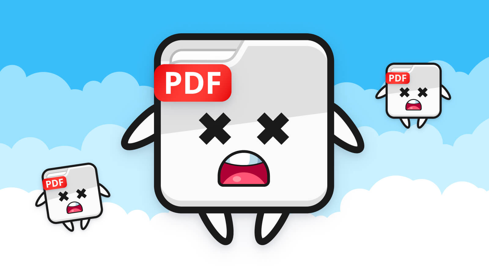
“How can I make my PDF accessible?” is a question we hear all the time and, of course, we’ve shared a bunch of tips on how to get your PDFs as accessible as possible. But the truth is; PDFs suck and you shouldn’t use them. Here’s why.
Time for a history lesson. PDF stands for Portable Document Format and they were created as a way of storing a print-ready document in a way that would never change.
But printers don’t care about words or letters or content, they just care about the visuals of the content. PDFs work the same way. They don’t store any semantic information like text or words because they weren’t designed to! “But my PDF has text on it!”, you might think. Well, that’s not text. Instead, the PDF is looking at a description of what should be displayed, not the actual content. It’s all smoke and mirrors designed to look like actual text.
You’ve probably experienced the effects of this too. If you’ve ever tried to copy and paste from a PDF you’ve likely found that it removes all the formatting. That’s because as far as the PDF is concerned, it doesn’t exist.
When it comes to accessibility and assistive technology like screen readers, content from a PDF is viewed exactly the same way as if you’d copied and pasted the text; all in one block, with no spaces or formatting.
The content inside PDFs is just not presented in a way that a computer can read. And that’s a problem.
Why is it a problem?
On the web, all content is written in a nice, clean way that both computers and people can understand. This means that we can do some really important things like mobile layouts and have content reflow to fit the smaller view.
Reflow is part of the Web Content Accessibility Guidelines (WCAG) 2.1 AA and is described as follows;
“Content can be presented without loss of information or functionality, and without requiring scrolling in two dimensions”
In simpler terms, content should still be at a legible size on a smaller screen but should reformat itself so that you don’t have to scroll left and right on a mobile view. Now back to PDFs; since the content isn’t actually stored anywhere, reflow of content in a PDF is impossible. If you’ve ever tried to read a PDF on your phone then you know how much of a pain this can be.
Pinch, scroll right, stop, scroll left and repeat. It’s horrific. Now imagine trying to do the same thing while suffering from hand tremors or a broken arm or any other disability that could affect your motor control. Does that sound like it’s accessible?
So, what’s the silver bullet solution? Well, there isn’t one. Not entirely anyway.
How to make PDFs better
PDFs can contain text. But not without some work. Using Adobe Acrobat you can do what’s called ‘tagging’. This involves doing some computer analysis to guess what the content in the PDF is and then layering all that important semantic information on top.
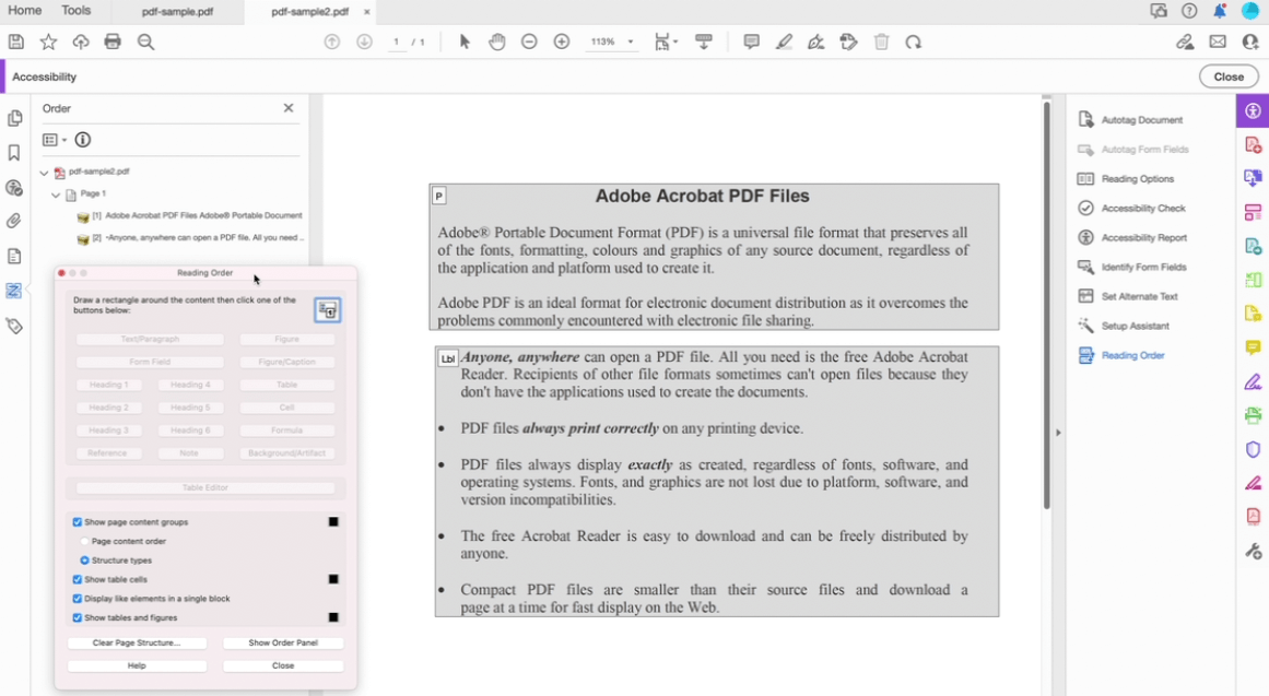
Sounds confusing? Well, that’s because it is. Not only is it complicated but, unless you’re an accessibility expert, it’s really hard to check your accessibility and confirm that it’s all done correctly. Just take a look at the screenshot below that shows the complicated tagging system inside of Adobe Acrobat. And this is for a very, very simple PDF.
Although tagging is one solution (kind of) we’d recommend just making your content an HTML webpage instead.
I know what you’re thinking. “But PDFs can be printed better and viewed offline!” And you’d be right. Unfortunately, that’s the one and only way in which PDFs excel. But take a step back and think about whether your next document really needs to be a PDF. PDFs cause a conflict between marketing teams wanting beautifully designed documents and a document that’s actually accessible since you’re fighting an uphill battle to make one thing do both. So, even if you do need to make a PDF, think about whether to provide a link to a completely accessible HTML version also. That’s something we’ve done recently with the launch of our latest eBook.
If you want more detail on making PDFs accessible, take a look at our guide to accessible PDFs, or, if you’re tired of reading, watch our webinar recording on how to make PDFs accessible.
To conclude…
If you rely on PDFs that aren’t correctly set up to be accessible, you’re forcing users with disabilities to find other ways of finding that information, such as over the phone, email, or live chat. Of course, this is a bad user experience but it’s also going to mean that you need more people to answer the phone more often. If you want to reduce phone calls or support emails then having that information available in an alternative format will benefit both you and the user.
And that’s the crux of the problem. PDFs block people from accessing information easily. What’s more, it’s not a quick fix to get them right. So, if you have a site infected with PDFs, get rid of them. They are bad, they don’t do anything more than the bare minimum without a fight and yet we still keep them around.